
General Assembly
The logo for this educational organisation indicates collaborative, creative energy through the use of a bold red gear, which can be imagined in rotation thanks to the hole in the A of the acronym.
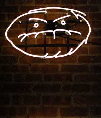
Café Grumpy
The coffee bean is rendered as a face, in a humorous gesture that sets this mini-chain of New York cafes apart and gives it a human quality amid its corporate competitors.
Related:21 Steps To Start-Up
Zipcar
The Z is transformed into a moving car with the help of a trailing airstream that indicates speed and efficiency. The logo sits comfortably within a green circle reminiscent of a “go” traffic light; the colour also signifies progress and sustainability.
West Virginia University
The state’s initials tuck together to form a shape that references the mountain ranges surrounding the school.
Housing Works
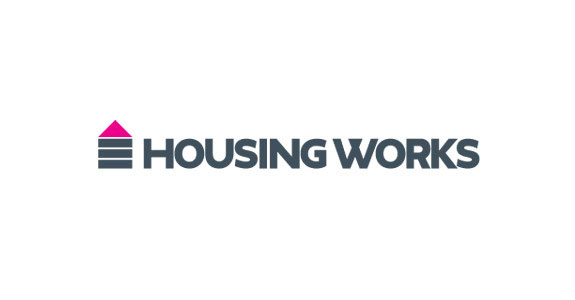
The simple rectangles and triangle in this logo depict the focus of this organisation: Providing a most basic need, housing. The upward-pointing pink arrow provides contrast and communicates a sense of positivity and progress.
Related:10 Steps To Starting Your Business For Free (Almost)
PieLab
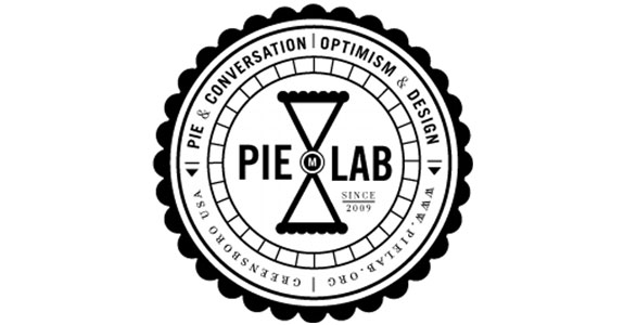
This nonprofit, whose mission is design for social change, is a venue for pie and conversation. A pie shown from above has within it two slices that take the shape of an hourglass, indicating that PieLab is a place to linger. The industrial quality of the logo reflects the founders’ design origins.
SoundCloud
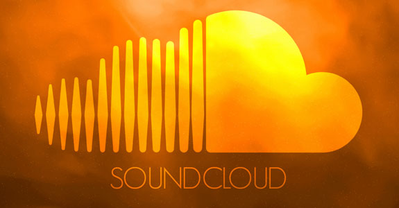
The vertical lines resemble the bars of a sound wave in this logo for the social audio platform. The visual transformation to a solid shape suggests that the remote cloud of music is secure and, more important, offers clear audio.
The Center for Urban Pedagogy
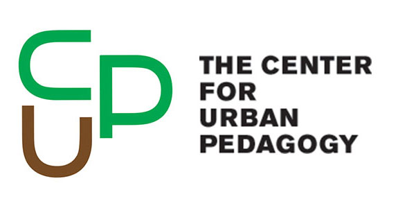
The acronym CUP is spelled out with a repeating cup-like shape. The cups are oriented in three directions, demonstrating the variety of the organisation’s work.
Related:15 Things Every Newbie Needs to Know About Starting a Business
Tribeca Film Festival
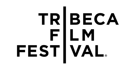
The three I’s form a continuous vertical bar that brings stability to the logo and is a reference to either a strip of film, a ray of light emerging from a projector or the flat surface of a screen.
Library Lovers Art Auction
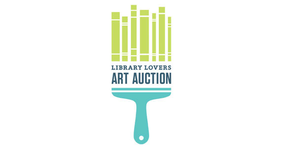
This logo has a fresh colour palette and cleverly uses books to depict a paintbrush or, alternatively, an auction paddle.
Colors
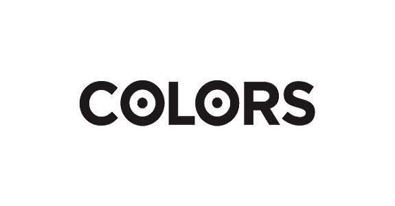
The choice of a broad and symmetrical font allowed for the O’s to be filled with dots, creating a pair of glasses with eyes – an appropriate choice for the logo of a magazine.
Related:The Secret Ingredients to a Successful Branding Strategy
Maryland Institute College of Art
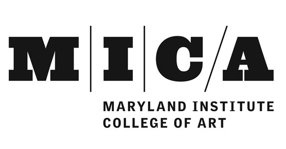
A diagonal slash adds contrast within the set of industrial letters, effectively filling the extra space that naturally occurs between the C and A. The slash also references the art school’s modern architecture and suggests that the institution’s philosophy is forward-looking.
Longwood Gardens
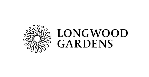
A cursive L rotates around the centre axis to form a flower in this logo for a horticultural centre – a simple design that’s effective because of the choice of an ornate, graceful font.
The Barnes Foundation
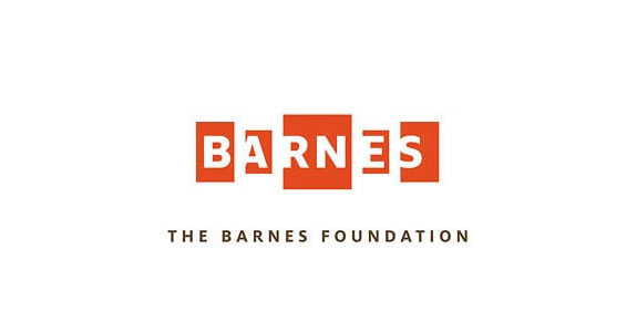
Letters on rectangles simulate paintings on gallery walls in this logo for the art institution. The shifts in size create perspective, giving the illusion that the A and E are farther away within the architecture of the building.
Related:Be Your Own Boss: 3 Easy Hacks
World Wildlife Fund
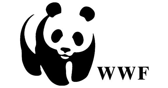
The first version of this logo appeared in 1961 with an outline on the panda. As the logo evolved, the line was eliminated; now the panda’s white patches are represented through negative space.
The head of the P and its sharpened point mimic a pushpin, replicating the function of this website. The connection between the S and T serves as counterbalance and reflects the site’s sense of community.
MIT Press
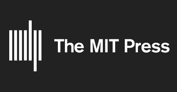
Seven rectangular bars form an abstract version of the acronym MITP for the logo of this university press. The symbol also references books on a shelf, or the bar code that appears on all books.
Evernote
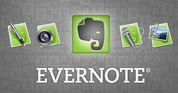
The logo for this app that helps people remember things features, appropriately enough, an elephant; the trunk is tucked squarely under its mouth, as though it is nourishing itself with information. The tip of the ear folds down as an “earmark” to reference the app’s functionality.
Buffer
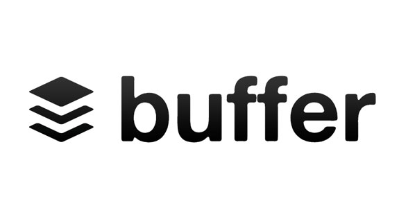
Simple, layered shapes, set at an angle, form the logo for this social media app, which organises the way people share articles, pictures and video online. The logo likens the app to an instantly recognisable, universal object: a paper organiser.
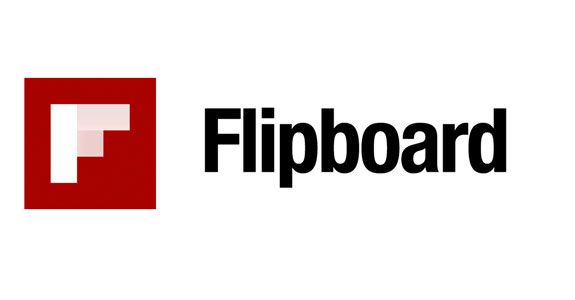
Rectangular panels of varying opacities on this F-shaped logo mimic the “page-turning” motion employed by this digital service, which allows users to create a grid-based magazine of online content.

Next Slideshow: The Top 10 Global Brands
Apple pips Coca-Cola to the post in the 2013 top brands listing. Click Here